Online Screen Ruler - An Accurate On-Screen Measuring Tool
Online Screen Ruler - An Accurate On-Screen Measuring Tool
Screen Ruler Online is a free browser-based measuring tool that turns any screen into an accurate ruler. Whether you need to measure a small component for a project, check the dimensions of a photograph, or verify the size of a physical object, this tool provides real-world measurements in centimeters, millimeters, and inches without requiring any software installation.
Try Our Other Tools
9 free online tools for measurement, calibration, and screen testing.
Online Ruler
Accurate on-screen ruler for measuring physical objects in cm/mm/inch.
Printable Ruler
Free printable ruler PDF — actual size, no calibration needed.
Device Specs Database
Detailed specs database for 69+ phones, tablets, and laptops.
Spinner Wheel
Random spinner wheel for decisions, classroom, and games.
Dead Pixel Test
Test your screen for dead, stuck, or hot pixels in 60 seconds.
Online Protractor
Online protractor for measuring angles up to 360°.
Screen Size Calculator
Calculate screen size from resolution and DPI for any device.
Pixel Converter
Convert px to rem, em, pt, %, vw, vh — instant CSS unit converter.
Aspect Ratio Calculator
Calculate aspect ratios for video, images, and screens.
Who Uses an Online Ruler?
Designers & Engineers
Verify physical dimensions of UI elements, components, and printed materials directly on screen. Compare mockup sizes against real-world specifications before sending designs to production.
Students & Teachers
Measure objects for science experiments, geometry homework, or art projects when a physical ruler is not available. Works well for remote learning environments.
Online Shoppers
Visualize product dimensions before purchasing. Check if a phone case, piece of jewelry, or accessory will fit by seeing its actual size on your screen.
DIY & Crafts
Measure fabric, paper, beads, or other craft supplies without digging through a toolbox. Your phone or tablet becomes a portable measuring station.
How Screen Measurement Technology Works
Digital screens display content using pixels, but the physical size of a pixel varies across devices. A pixel on a 5.8-inch iPhone has a very different physical size than a pixel on a 27-inch desktop monitor, even if both screens have similar resolutions.
The key metric is PPI (Pixels Per Inch), which describes how many pixels fit in one physical inch of screen space. Our ruler uses calibration to determine your specific screen's PPI, then applies this ratio to convert pixel measurements into accurate real-world units. For example, if your screen has 110 PPI, then 110 pixels equal exactly one inch, and approximately 43.3 pixels equal one centimeter.
Modern high-resolution displays (like Apple Retina or Samsung AMOLED screens) use device pixel ratios greater than 1x, meaning each CSS pixel maps to multiple physical pixels. Our calibration system accounts for this automatically, ensuring accurate measurements regardless of your display technology.
Frequently Asked Questions
How accurate is an online screen ruler?
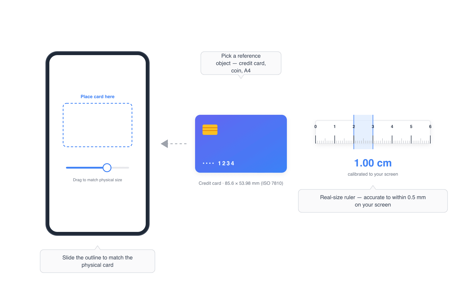
After calibration with a credit card or known reference object, our online ruler achieves accuracy within 0.5mm on most devices. The precision depends on your screen resolution and calibration quality. Higher PPI displays like Retina screens generally provide better accuracy.
Does the ruler work on mobile phones and tablets?
Yes. The ruler works on any device with a web browser, including iPhones, Android phones, iPads, and Android tablets. Touch controls are fully supported for mobile measurement. Simply open the website, calibrate with a credit card, and start measuring.
Do I need to download an app to use this ruler?
No download or installation is required. This is a web-based ruler that runs directly in your browser. You can also add it to your home screen on mobile devices for quick access, making it work like a native app.
Why do I need to calibrate the ruler?
Every screen has a different pixel density (PPI). A 14-inch laptop and a 27-inch monitor may have the same resolution but very different physical pixel sizes. Calibration tells the ruler your screen's exact scale so it can convert pixels to real-world measurements like centimeters and inches.
What objects can I use for calibration?
The most reliable calibration object is a standard credit card or debit card (85.6mm x 54mm, an ISO standard). You can also use coins like a US quarter (24.26mm diameter) or an A4 sheet of paper (297mm x 210mm). Any object with a known size works.
Does the calibration persist between visits?
Yes. Once you calibrate, your settings are saved in your browser's local storage and remain valid for 30 days. If you return to the ruler on the same device and browser, it will remember your calibration automatically.
Which tool should I use — ruler, protractor, or spinner?
Pick the ruler for measuring length (cm, mm, inches), the protractor for measuring angles from 0° to 360°, and the random spinner when you need a fair random pick from a list of options. All three are free, run entirely in your browser, and require no sign-up.
How accurate is the online protractor?
The protractor displays angles with 1° precision by default, and with 0.1° precision when you disable snapping. Accuracy depends on how carefully you align the two rays with the lines you want to measure — for pixel-perfect work, enlarge the reference diagram or photo before dragging the rays.
Is the random spinner actually random?
Yes. The spinner uses a uniform random distribution, so every option you add has exactly the same probability of winning. The outcome is decided before the animation starts — the visible spin is purely for show. Your list of options stays in your browser and is never sent to a server.
Works on Every Device
This ruler is tested and optimized for a wide range of devices and browsers. It supports touch interaction on mobile devices and mouse controls on desktops. Auto-detection identifies your device model and pre-configures the PPI for common devices including iPhone 15 Pro Max, iPhone 14, Samsung Galaxy S24 Ultra, Galaxy S23, iPad Pro, iPad Air, and many more.
For devices not in our database, the credit card calibration method provides a universal way to achieve accurate measurements. The ruler works in Chrome, Safari, Firefox, Edge, and any modern browser that supports standard web technologies. No plugins, extensions, or special permissions are needed.
Popular Guides
Related Articles
- The Complete Guide to Using an Online RulerRead more →
- The 7 Best Online Ruler Tools ComparedRead more →
- How Pixel Density (PPI) Affects On-Screen Ruler AccuracyRead more →
- Online Ruler for Designers: Measure Layouts Without Leaving the BrowserRead more →
- 20 Questions About Online Rulers AnsweredRead more →